Default
The signature HeroUI Native look — clean surfaces, soft radii, and balanced typography that works out of the box.
The Default theme is the signature HeroUI Native look. Clean surfaces, soft radii, and balanced typography — every component ships styled with it out of the box, so there is nothing extra to import.
Preview

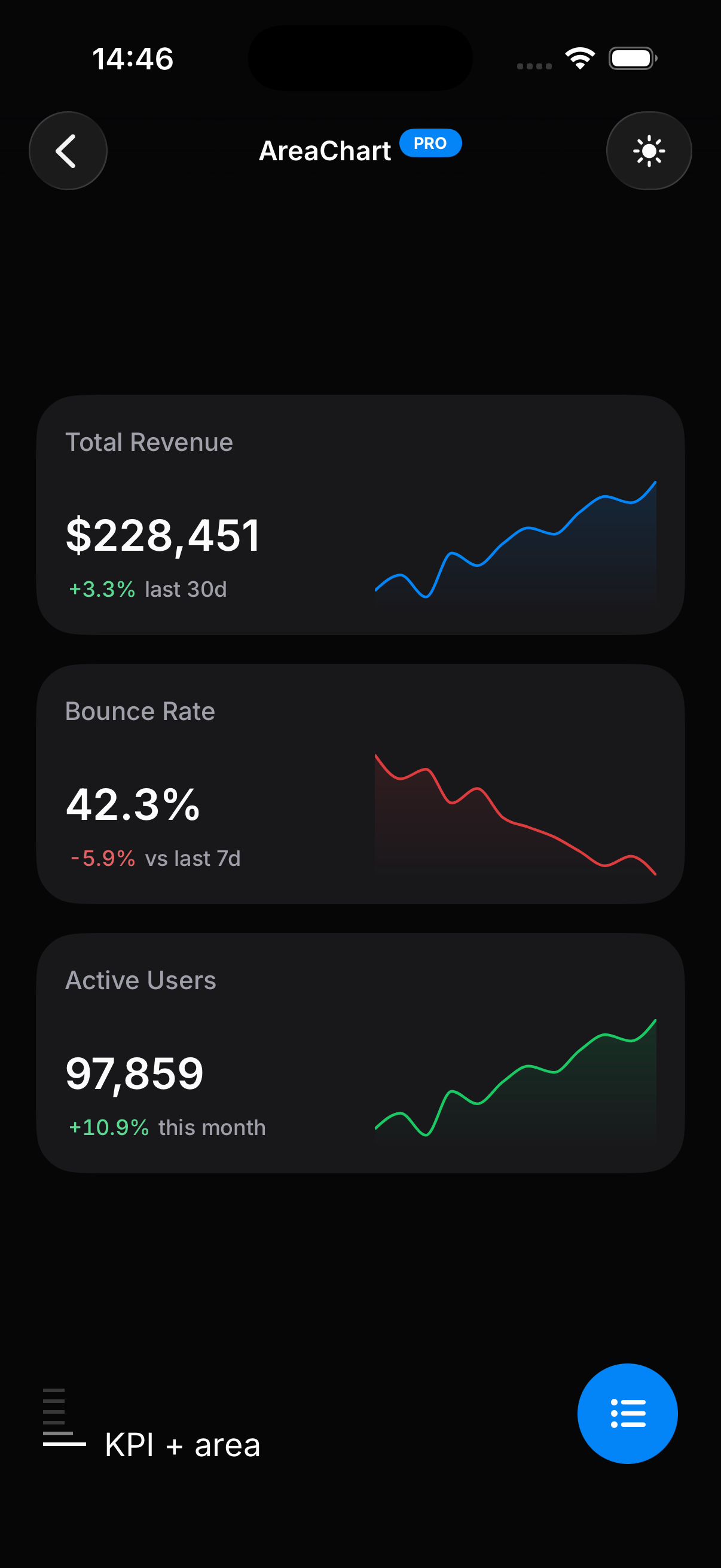
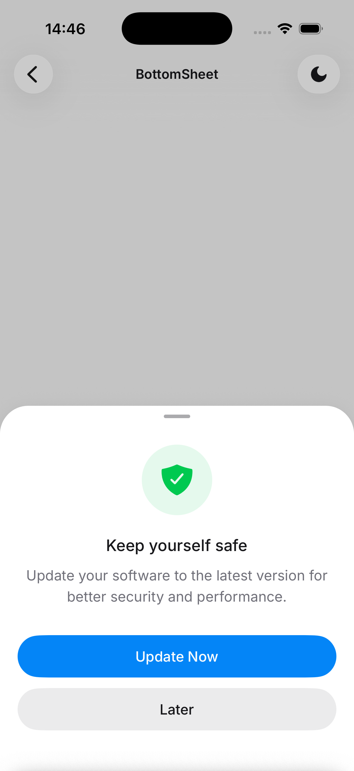
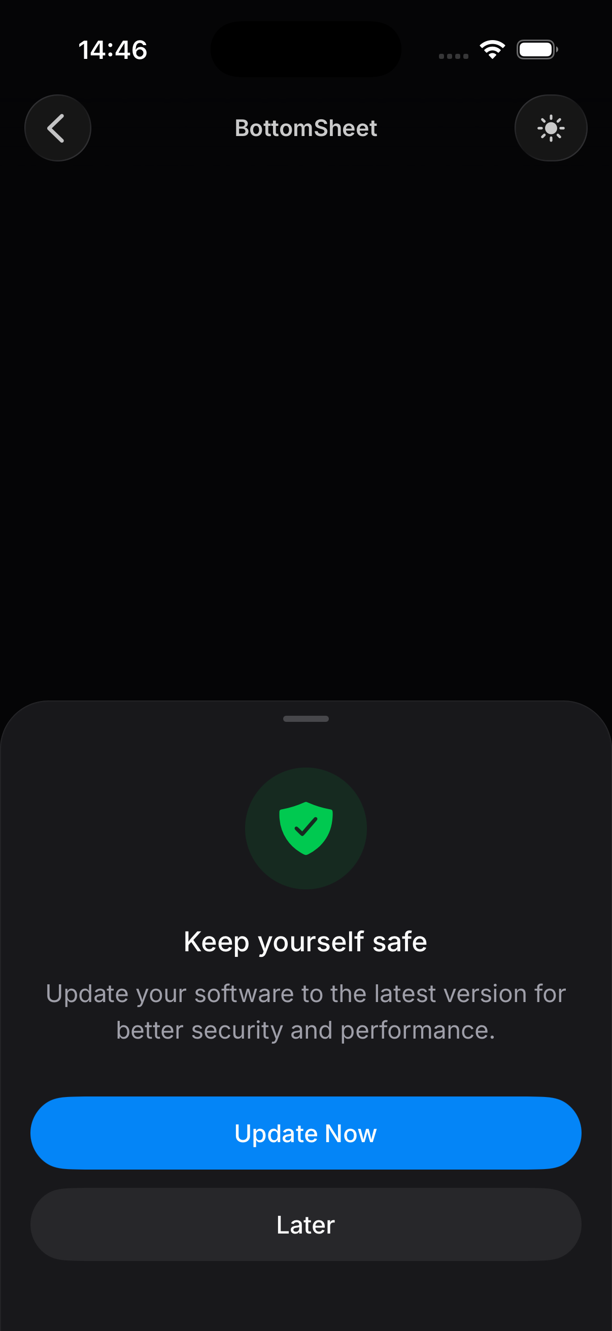
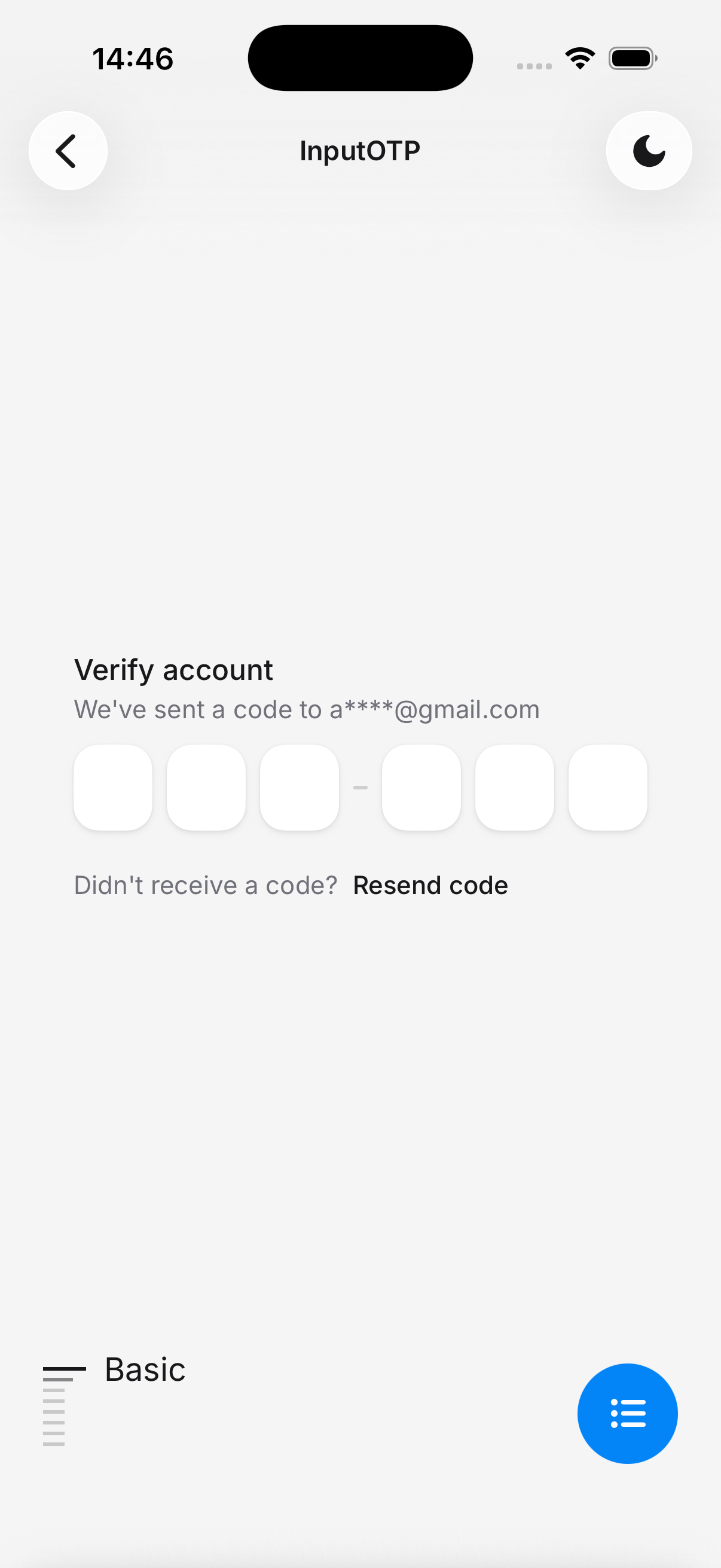
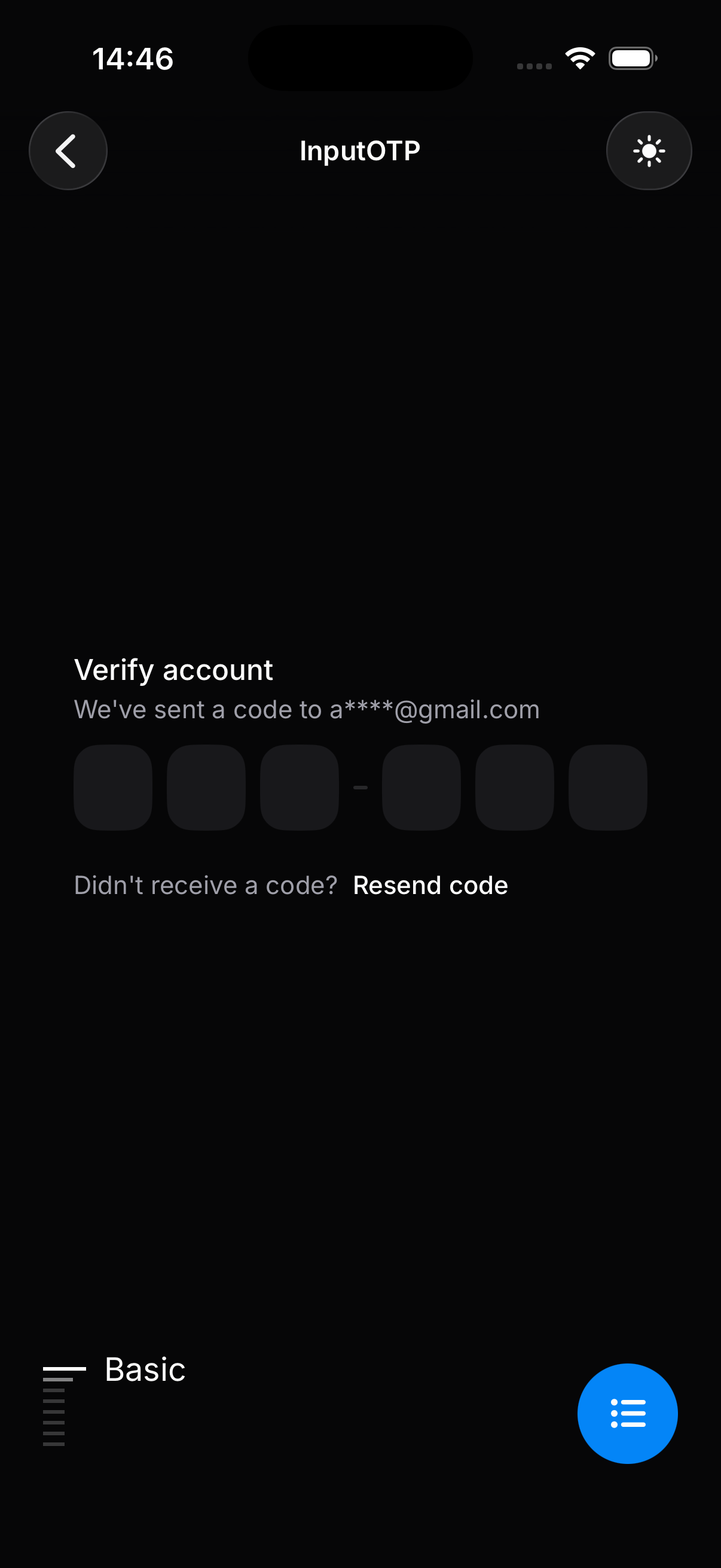
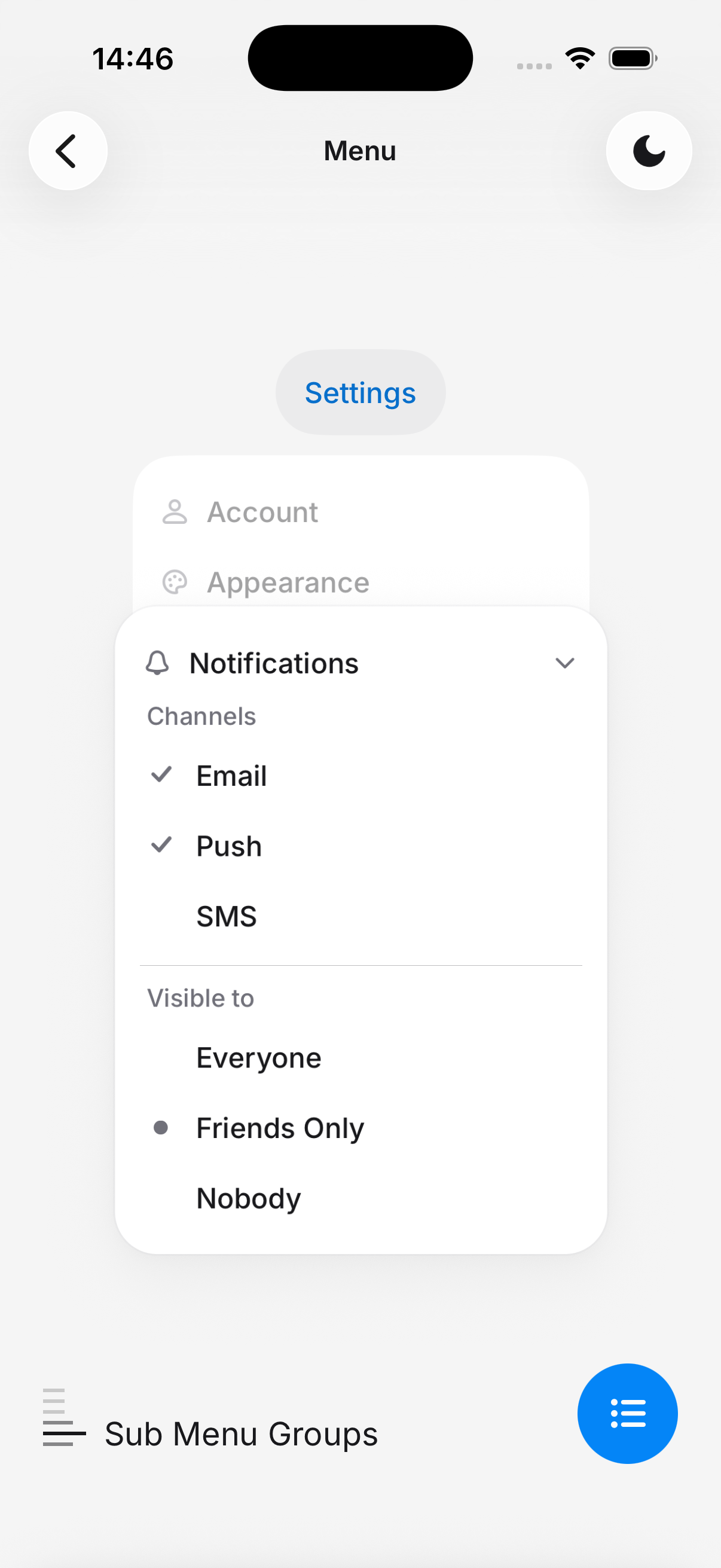
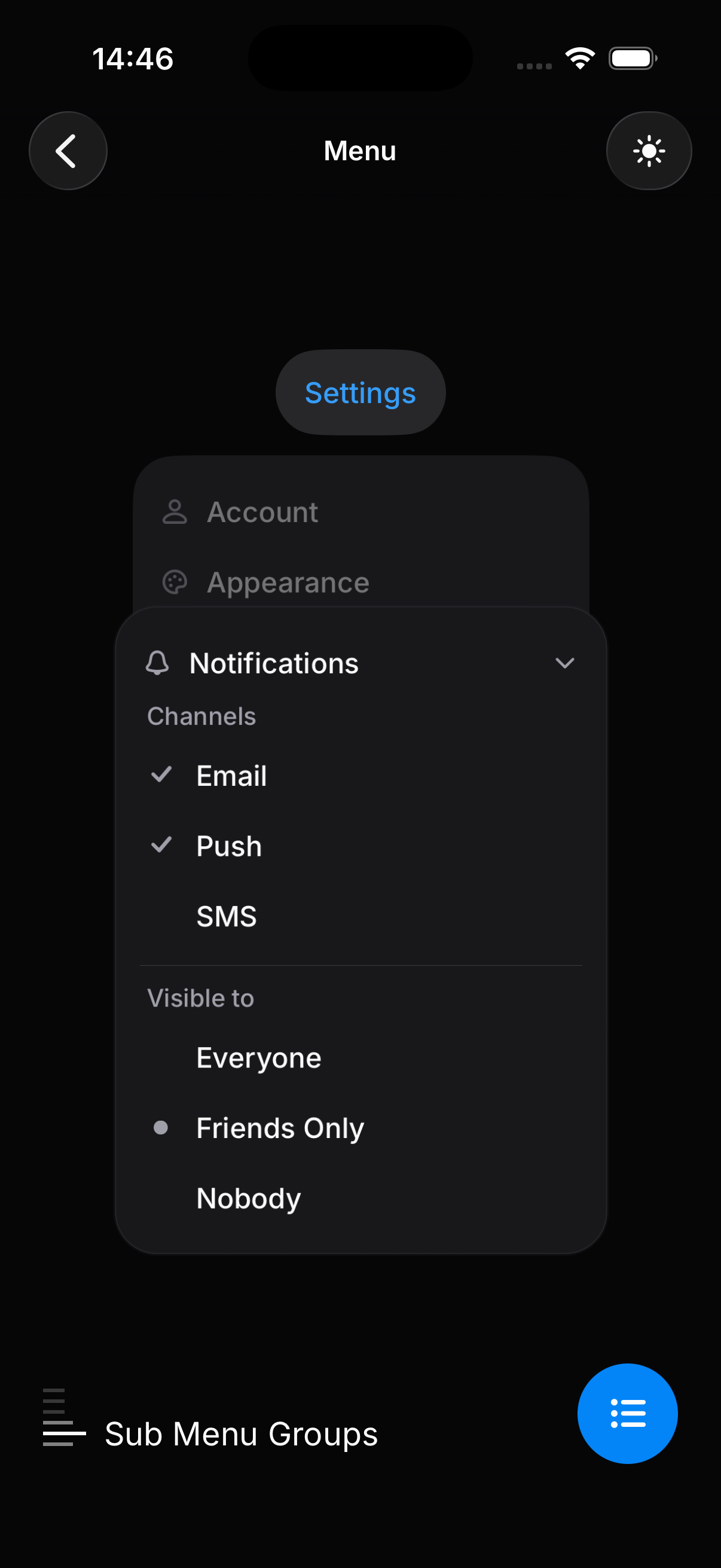
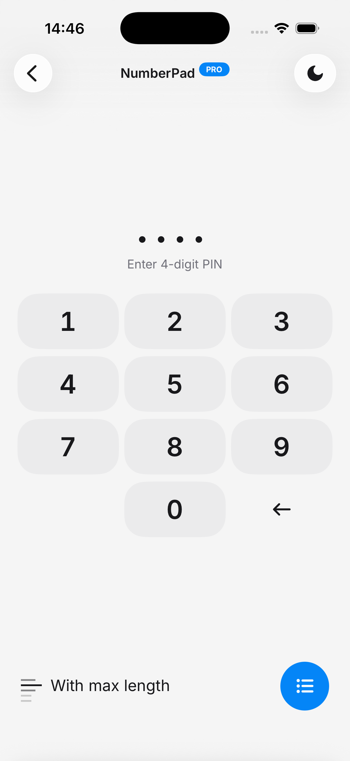
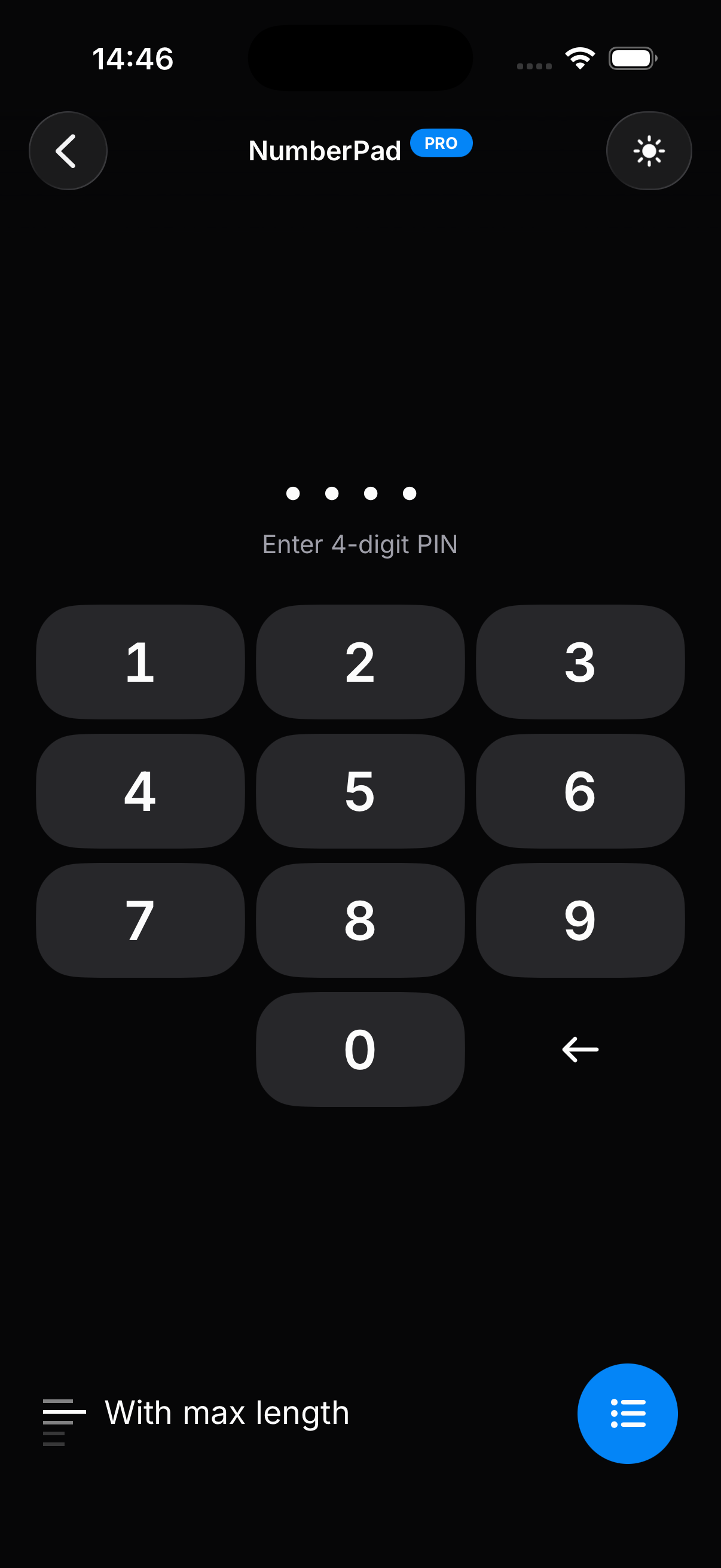
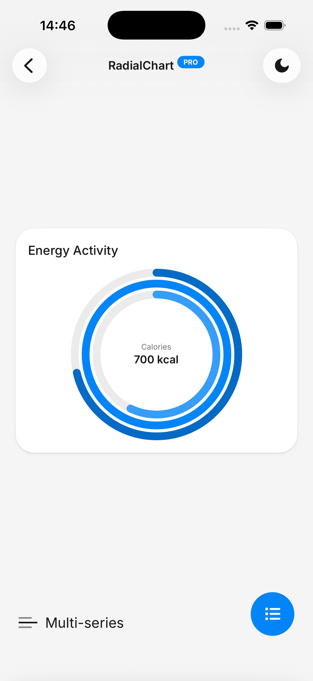
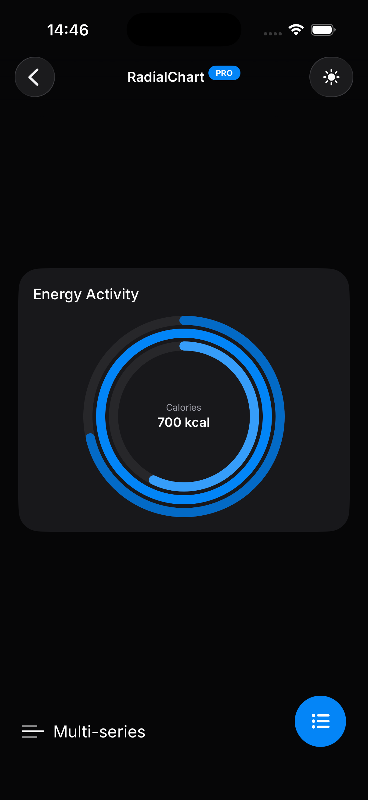
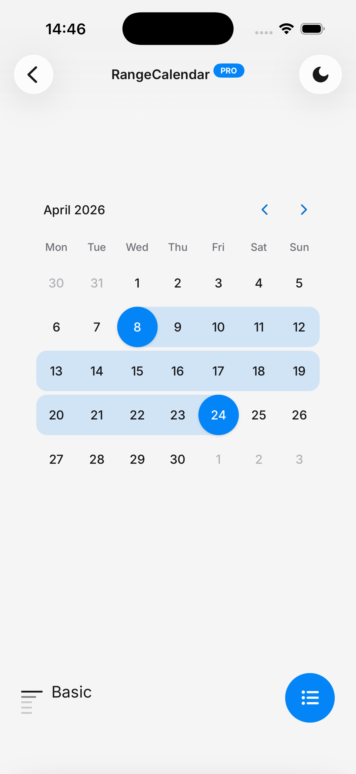
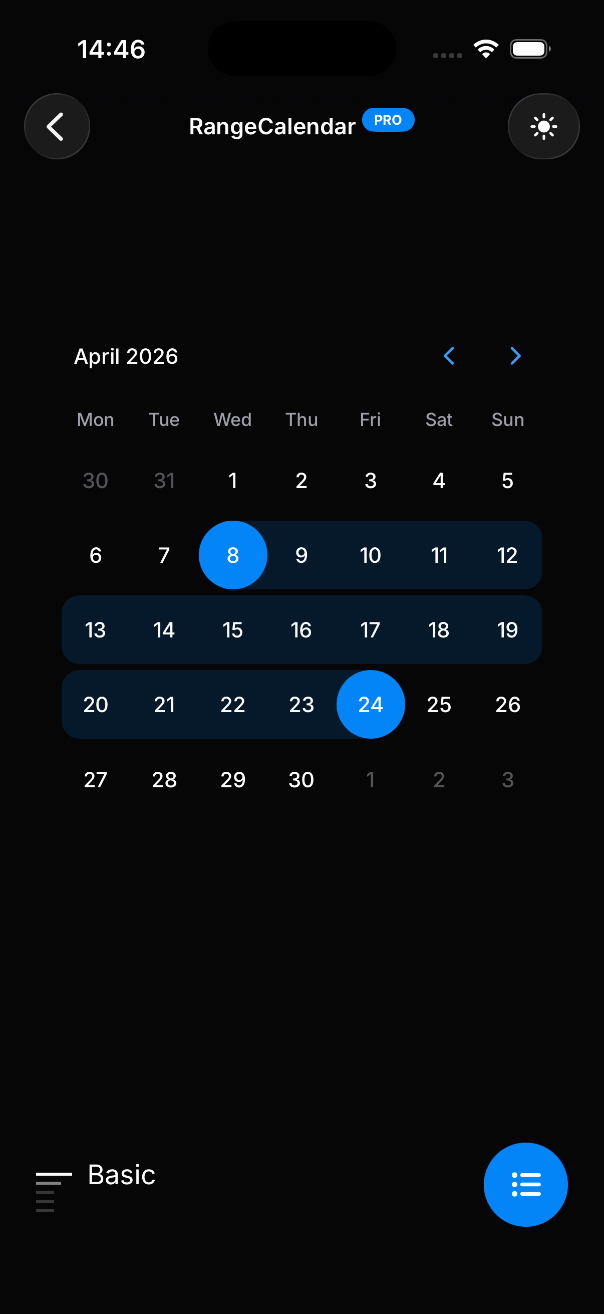
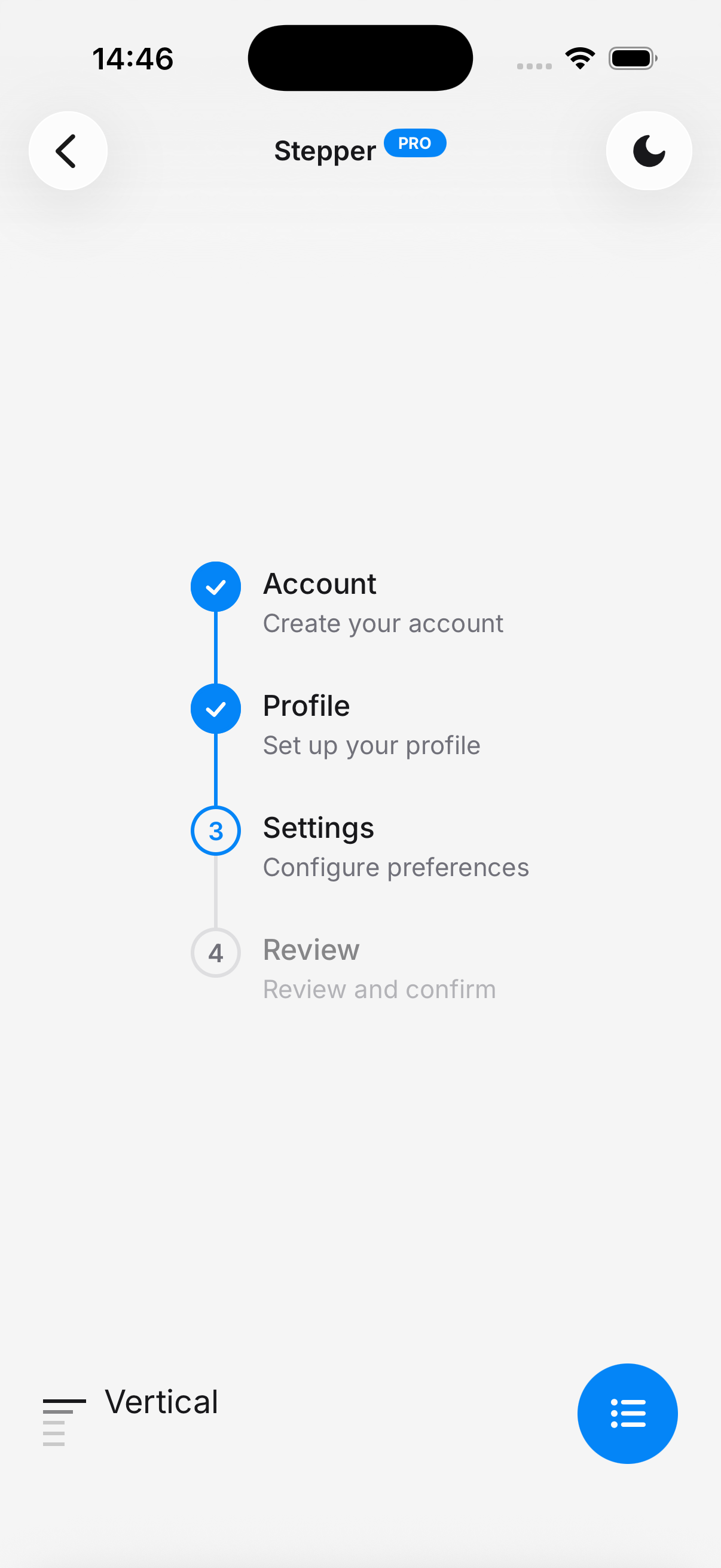
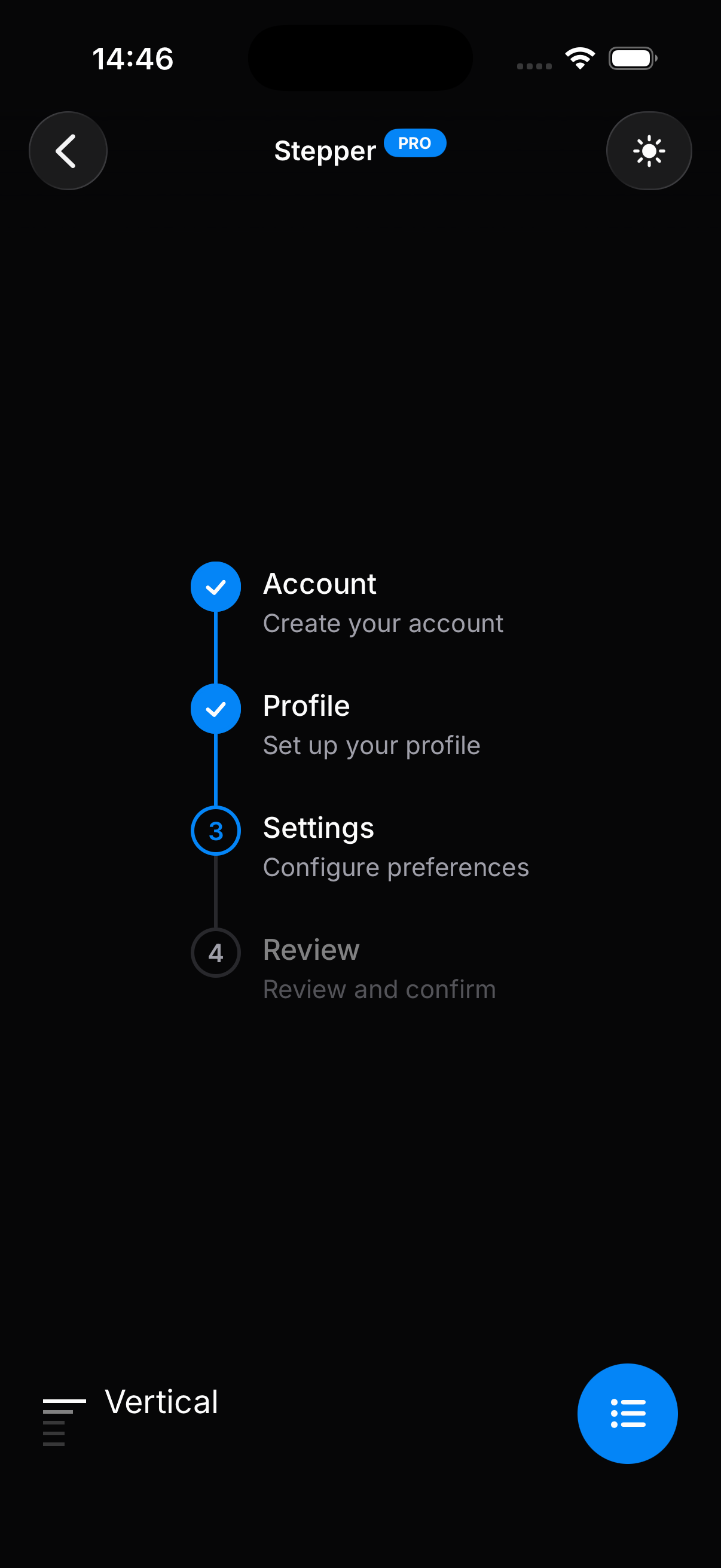
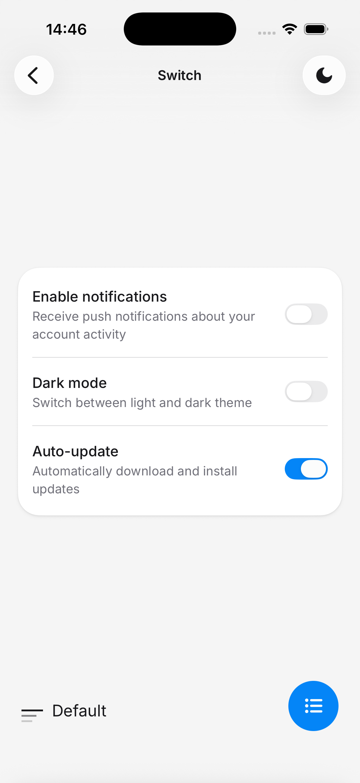
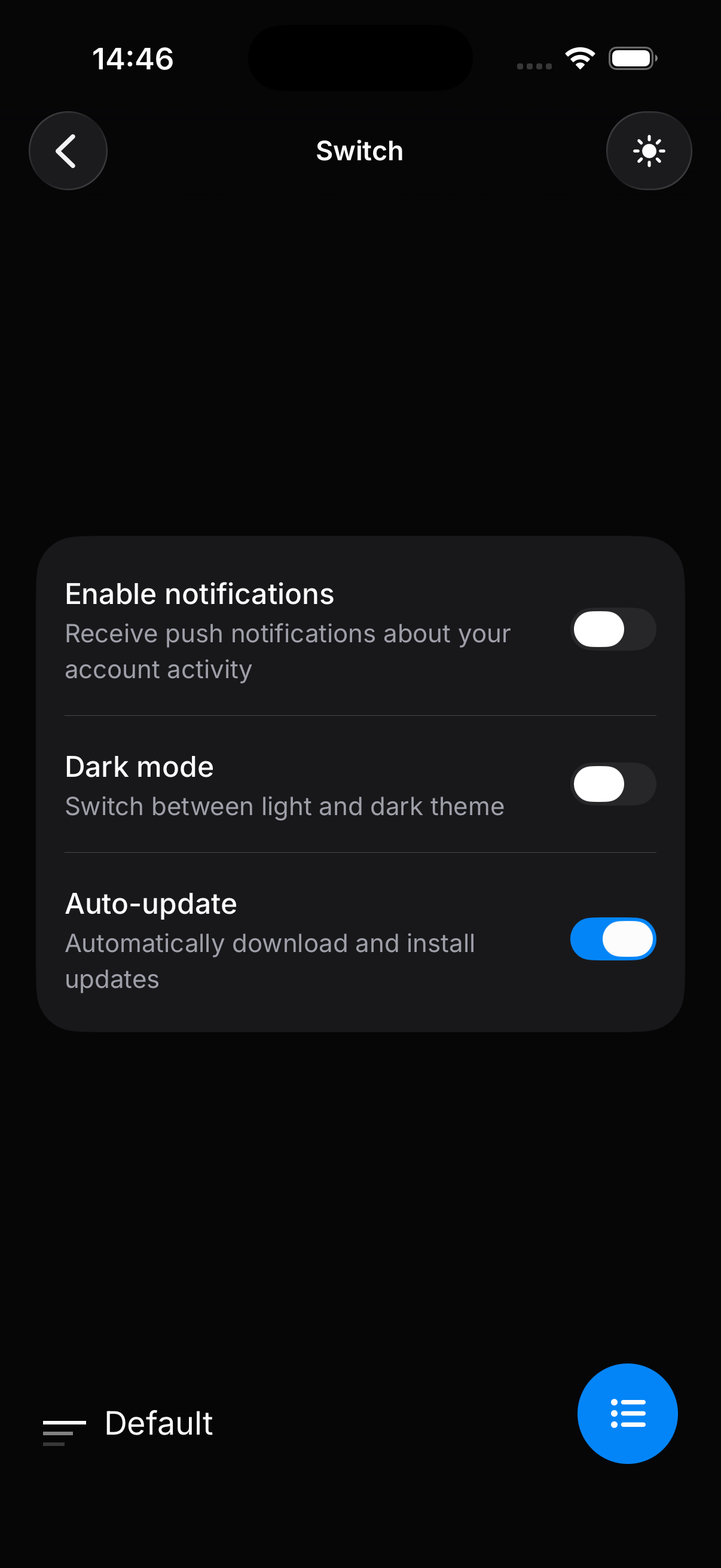
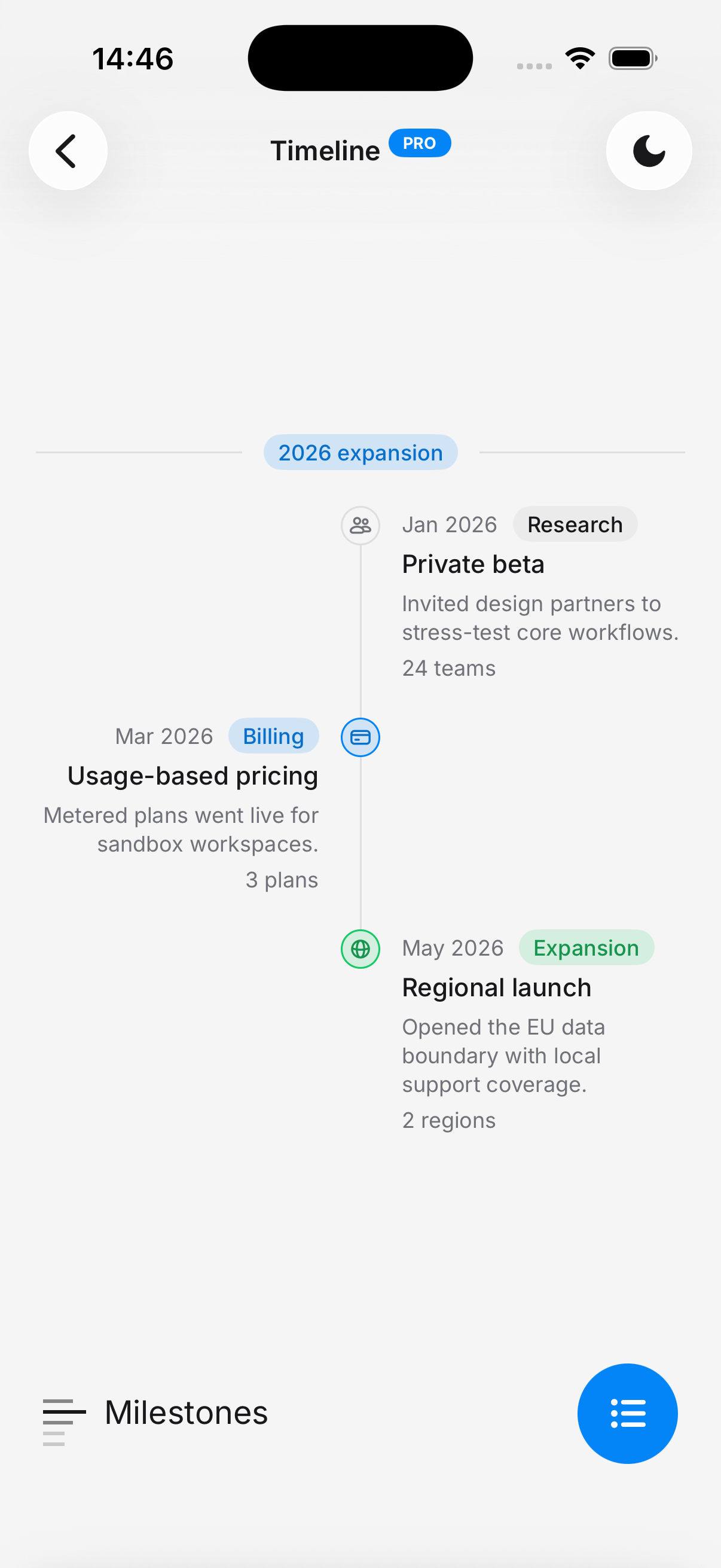
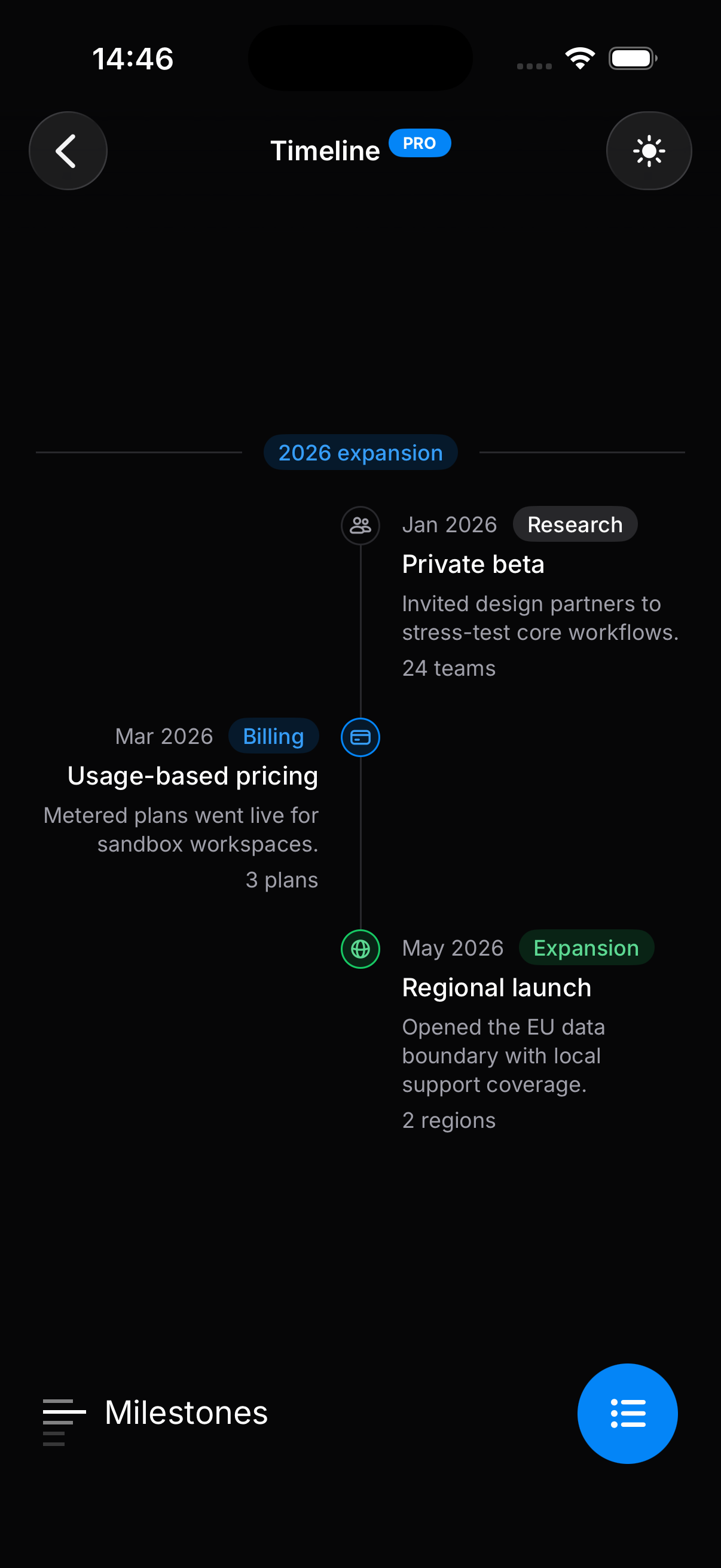
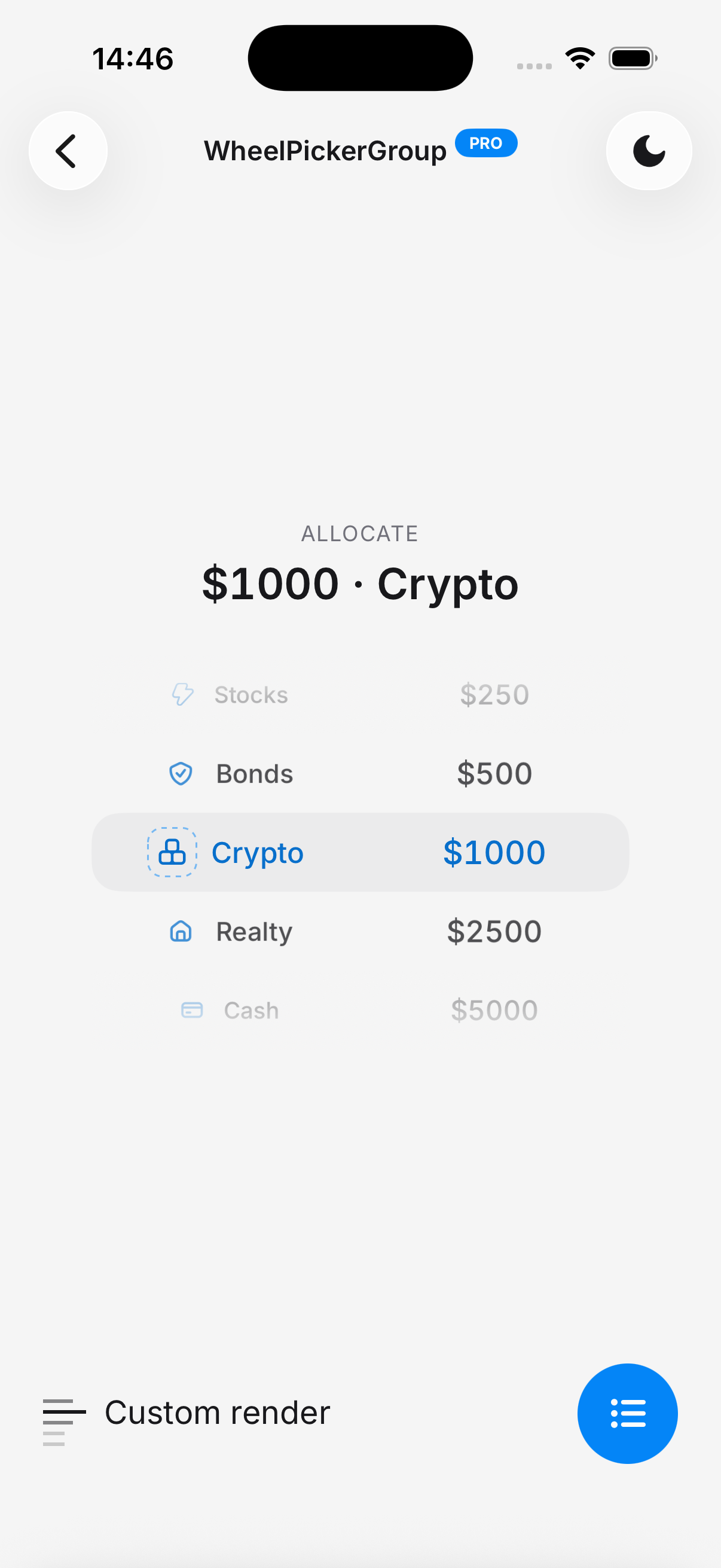
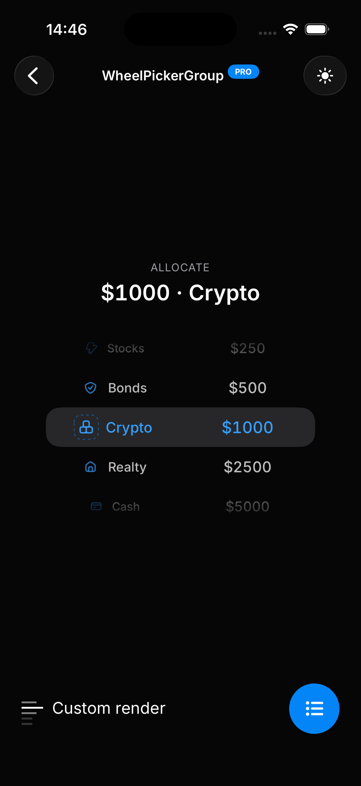
Try It on Your Device
Don't have the HeroUI Native app yet? Download it below.
Installation
The Default theme is included with HeroUI Native. If you haven't installed the package yet, follow the Installation guide first.
Add the HeroUI Native and HeroUI Native Pro source paths to your global.css file so Tailwind can scan component classes:
@import 'tailwindcss';
@import 'uniwind';

@import 'heroui-native/styles';
@import 'heroui-native-pro/styles';

@source './node_modules/heroui-native/lib';
@source './node_modules/heroui-native-pro/lib';
The @source path is relative to your global.css file. Adjust accordingly if your CSS file is not at the project root (e.g., ../node_modules/heroui-native-pro/lib if global.css is in app/).