1.0.0-beta.7
Adds the Brutalism theme and extracts every component's styles into overridable BEM CSS, so a single import can restyle the entire library.
The seventh beta of HeroUI Native Pro introduces a proper theming system. Every component's styles have been extracted into overridable BEM CSS classes, which unlocks the first premium theme: Brutalism — bold borders, hard shadows, and display typography that restyle the entire library with a single import. Nothing changes in your component code; drop the theme stylesheet into your global.css and the whole app follows.
Installation
Follow the installation guide to authenticate the private registry with your HEROUI_PERSONAL_TOKEN, install heroui-native-pro, and wire up HeroUINativeProvider.
What's New
Themeable Component Styles
Every HeroUI Native Pro component now renders through named BEM CSS classes instead of inline-only styles. Each component exposes a stable block__element--modifier class surface (e.g. button, button__label, button--pressed) that a theme stylesheet can target and override — without touching a single line of component markup.
This is the foundation the theme system builds on: a theme is just a CSS file that redefines those BEM classes and design tokens. Because the class surface is stable and component-scoped, themes stay decoupled from component internals, and you can override as little or as much as you like.
What this enables:
- Single-import theming — add one
@importtoglobal.cssto restyle every component at once - Stable BEM class surface — predictable
block__element--modifierhooks per component for targeted overrides - Token + class layering — themes redefine design tokens and BEM classes, so you can nudge one component or reskin the whole library
- Zero code changes — theming is purely CSS; component APIs and markup are untouched
Brutalism Theme
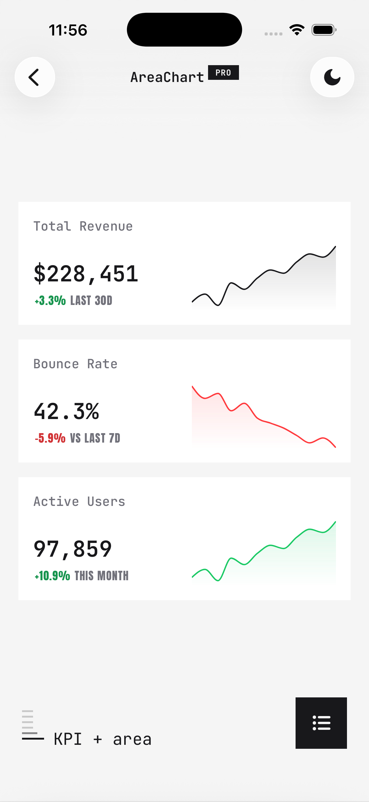
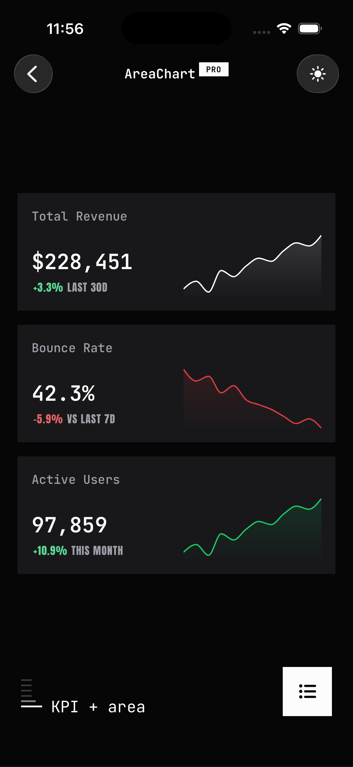
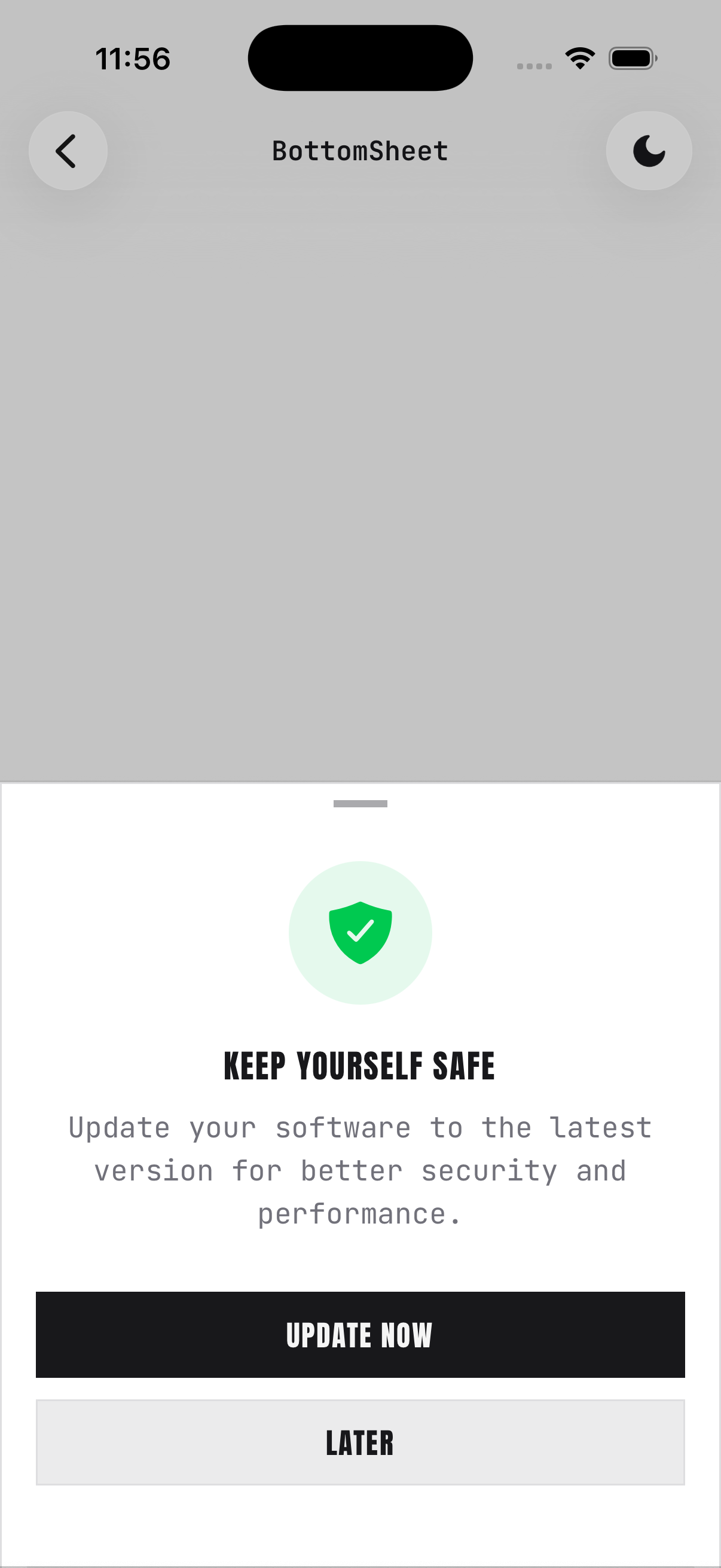
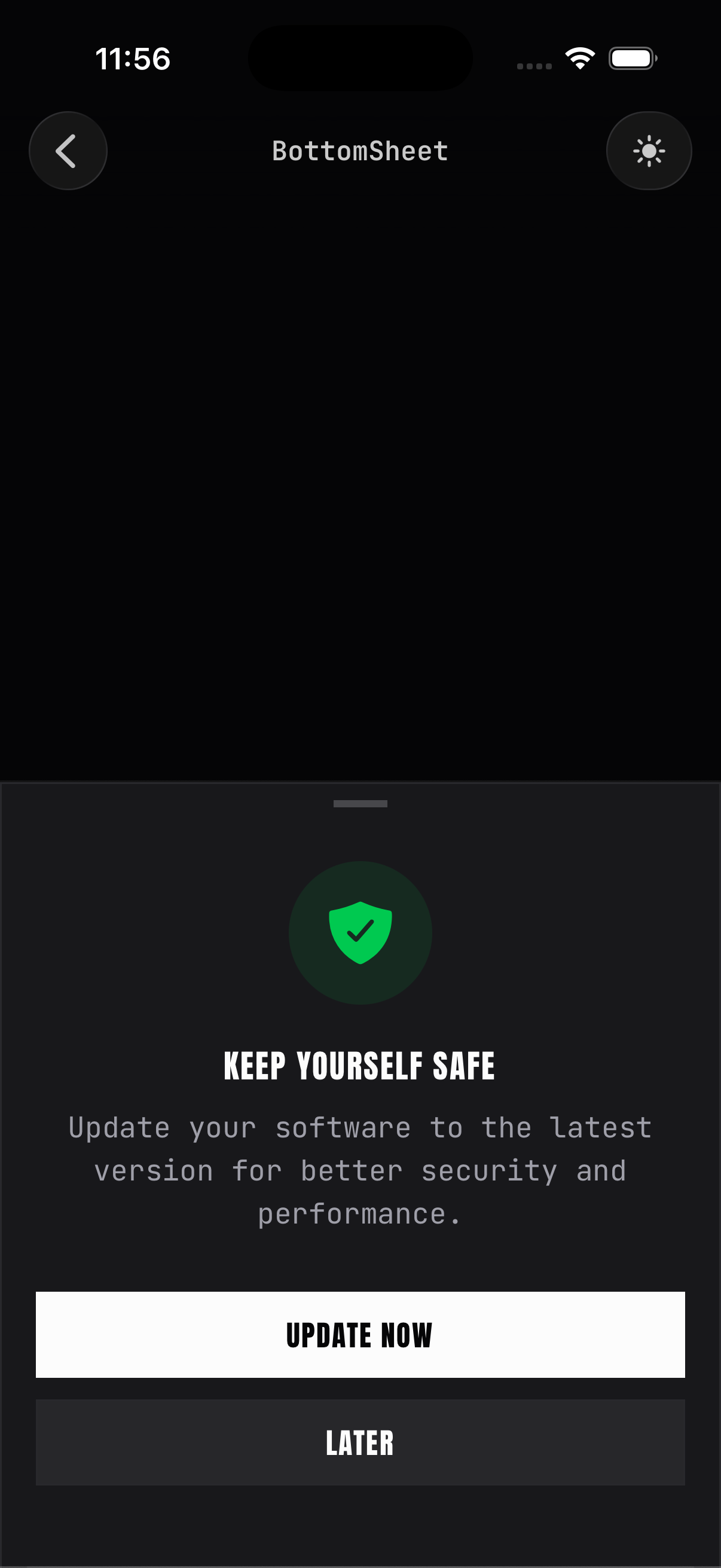
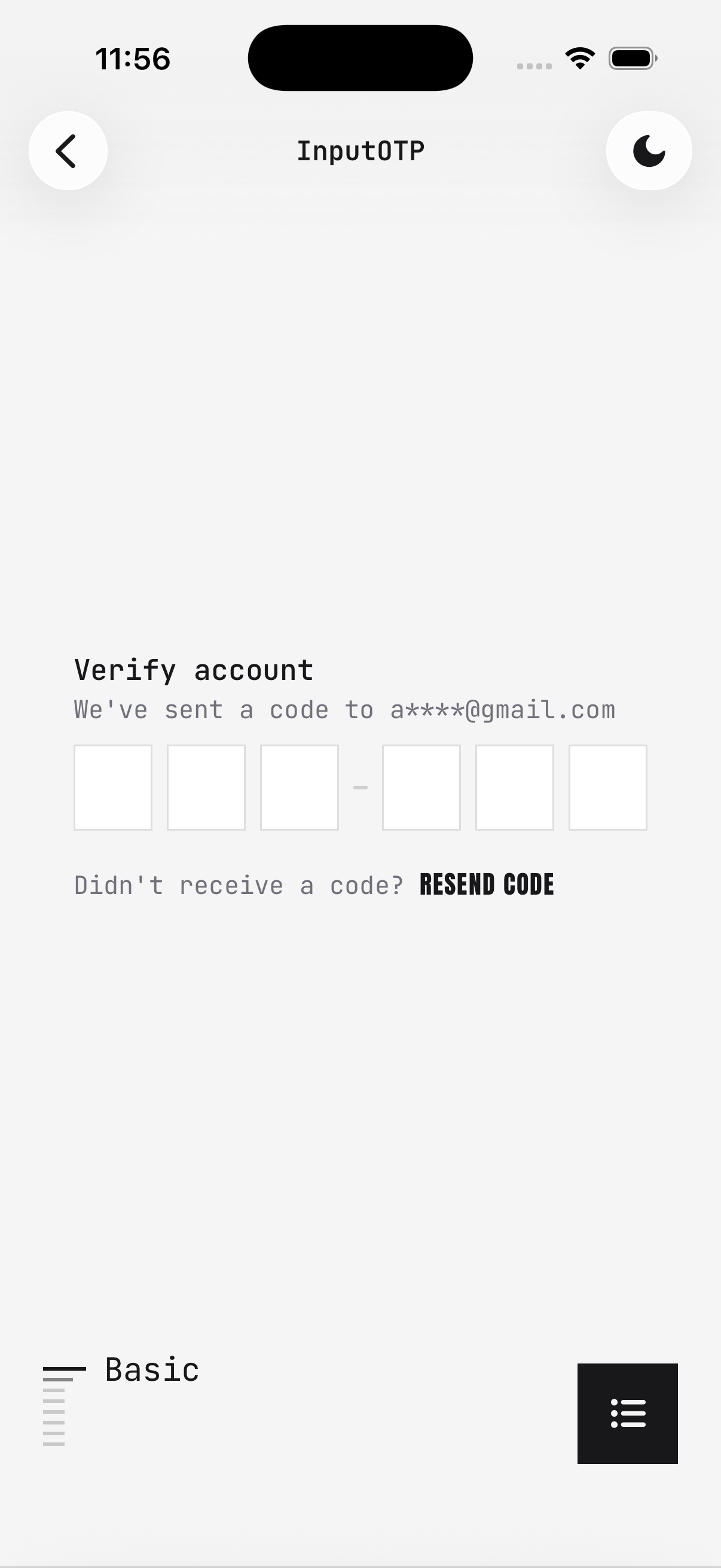
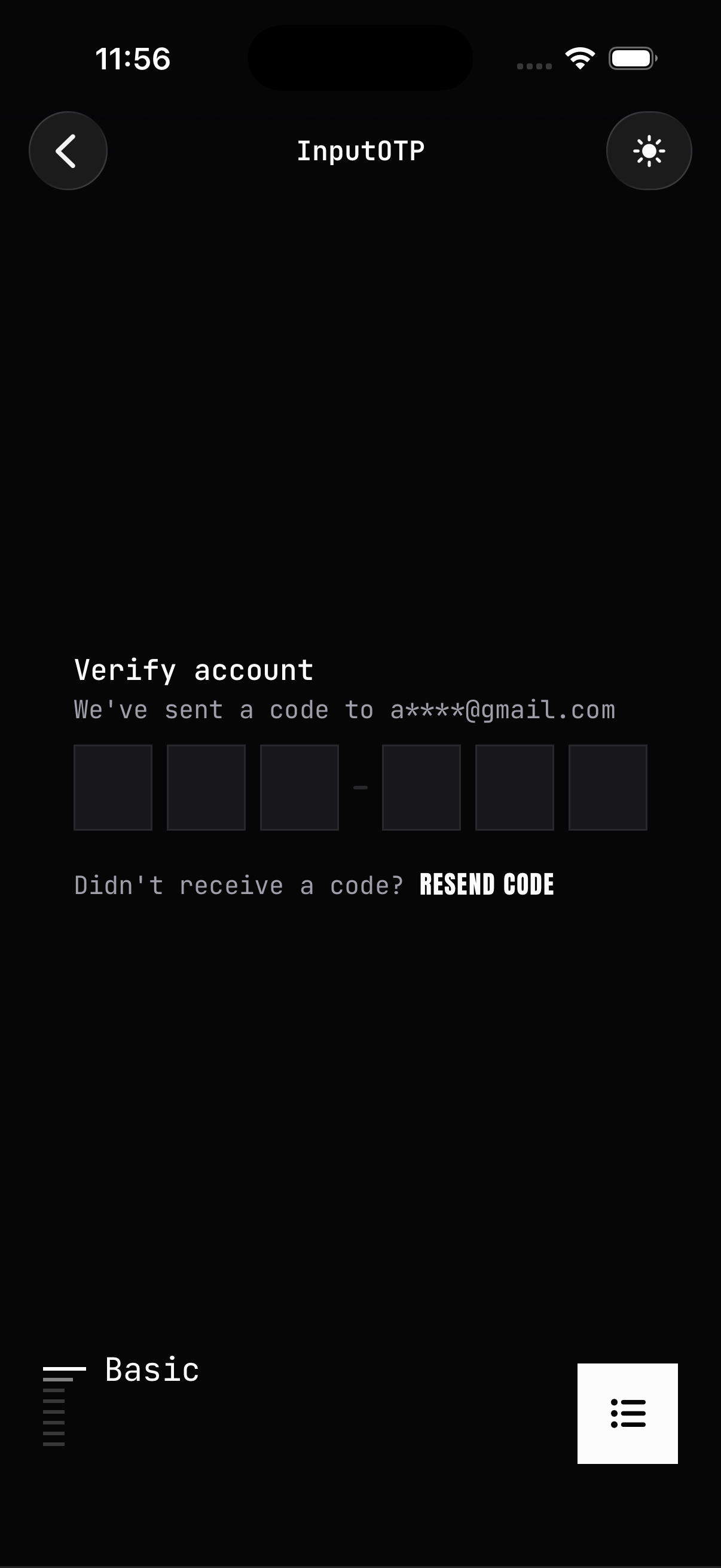
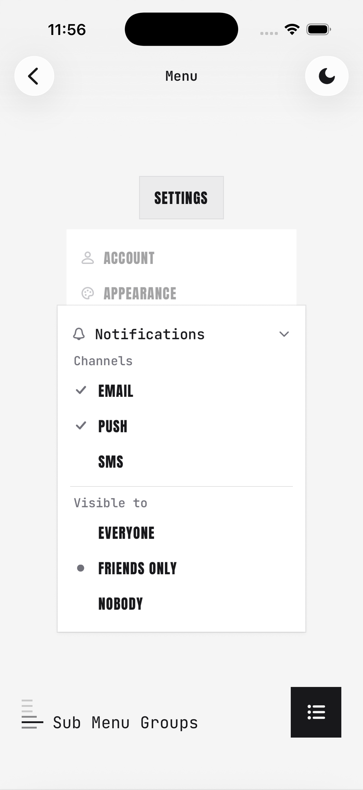
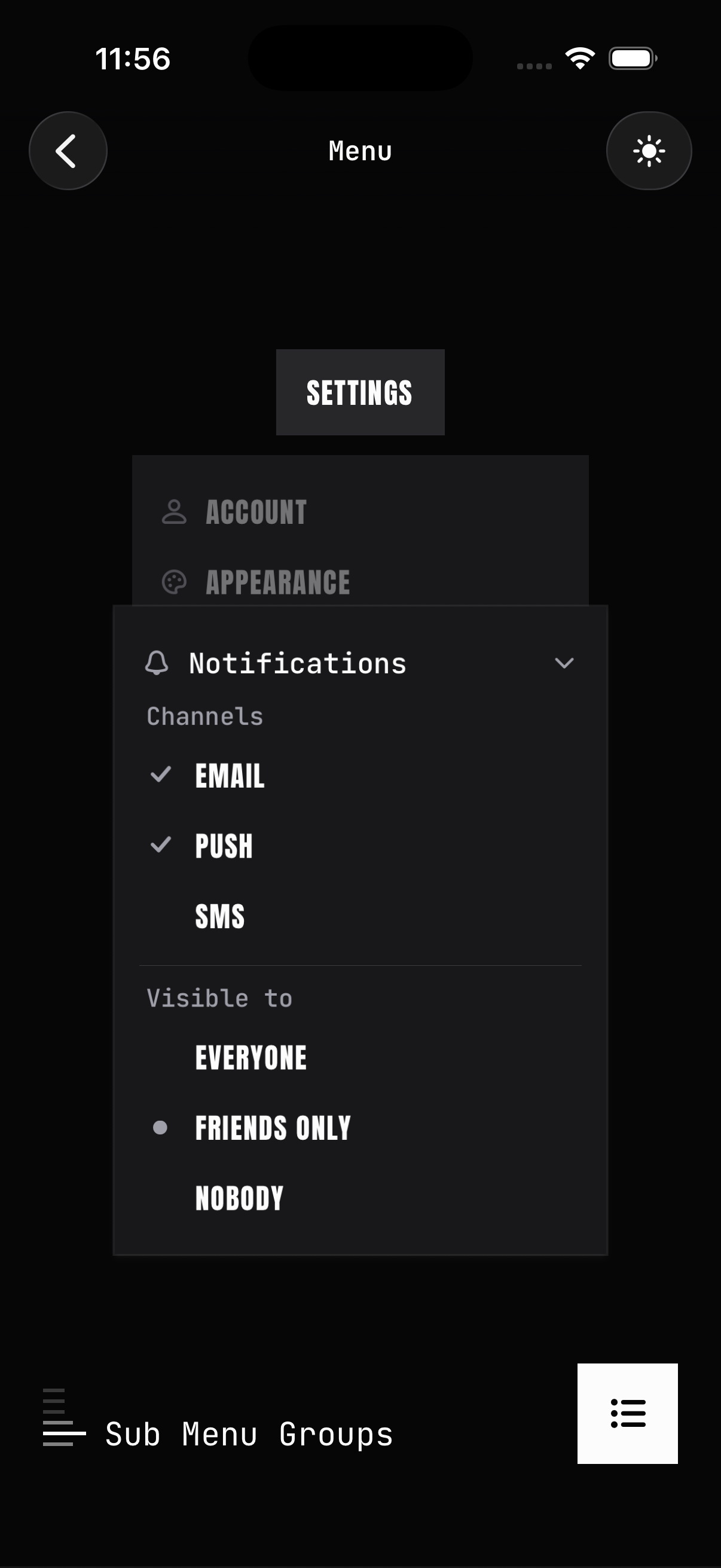
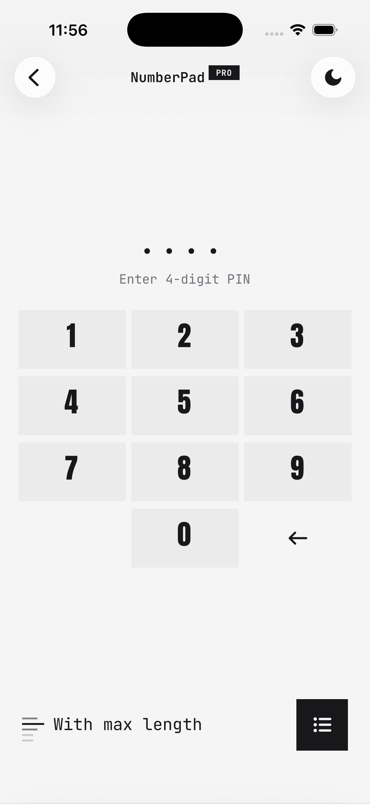
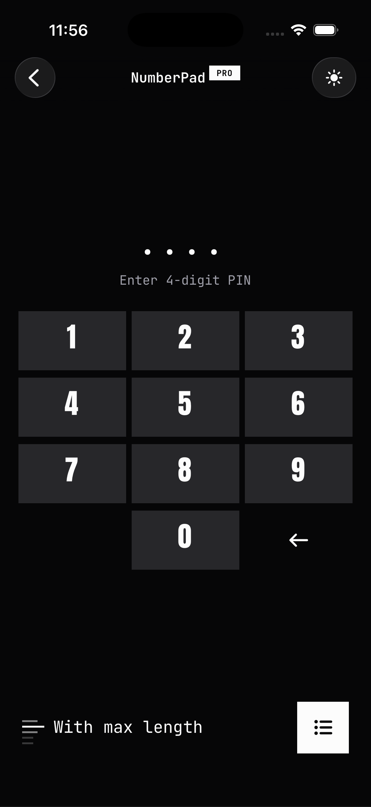
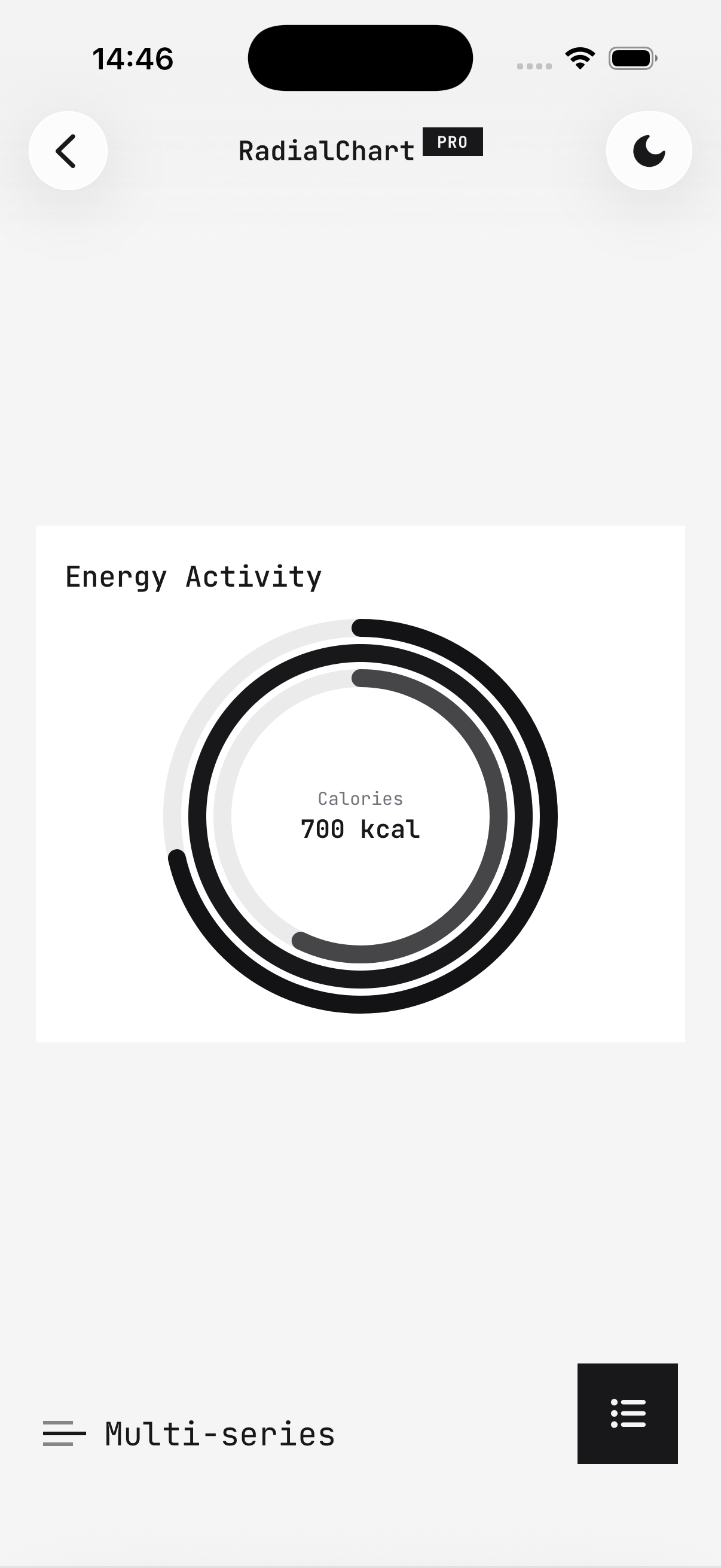
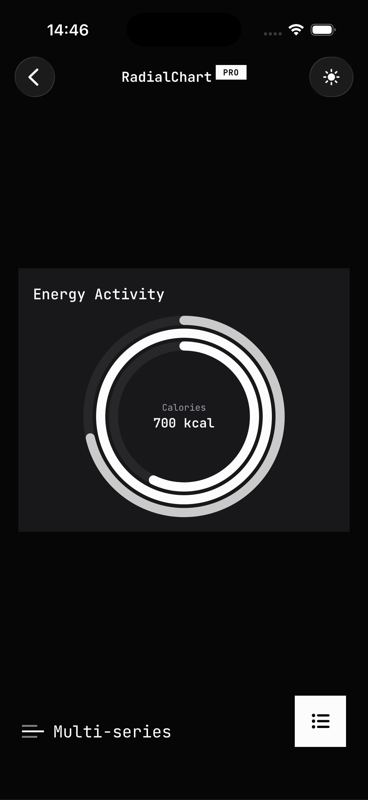
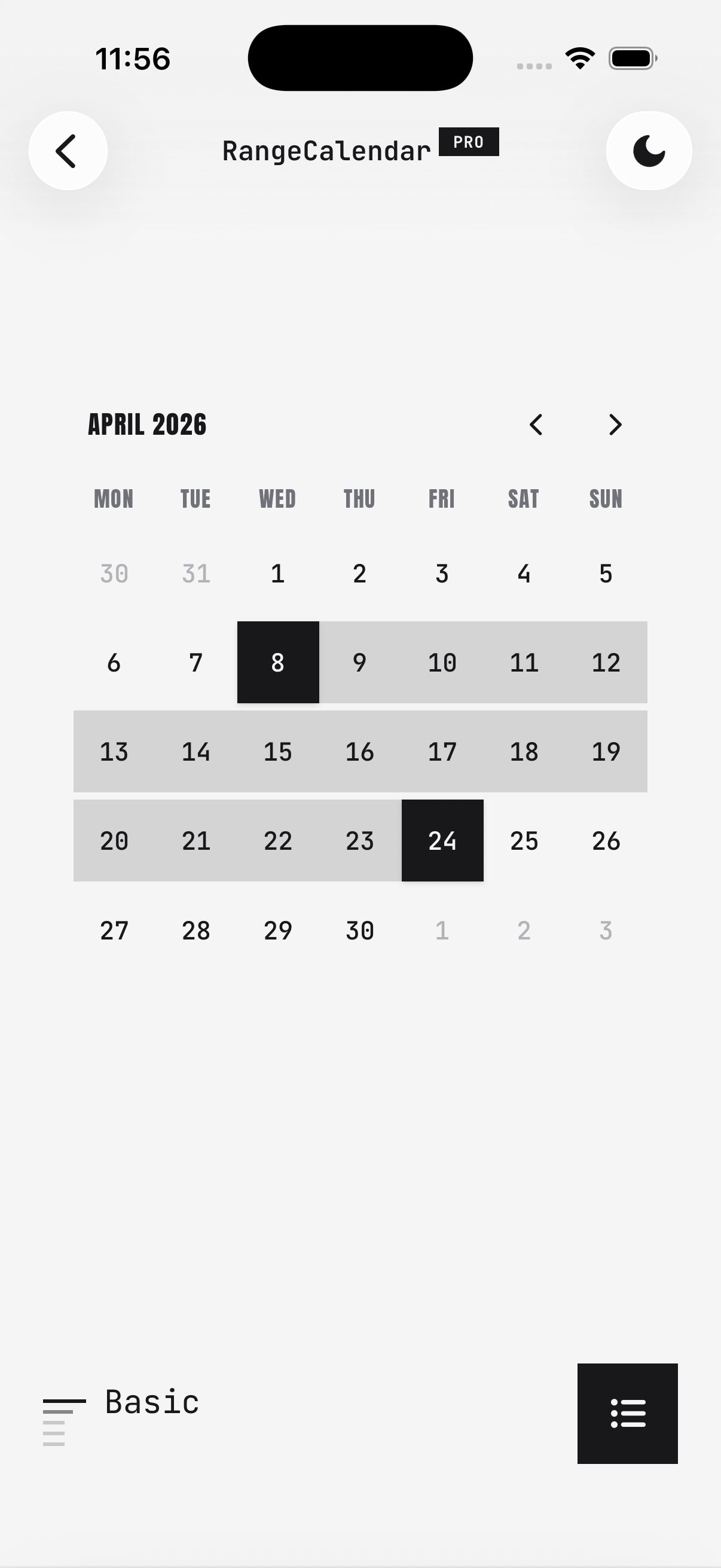
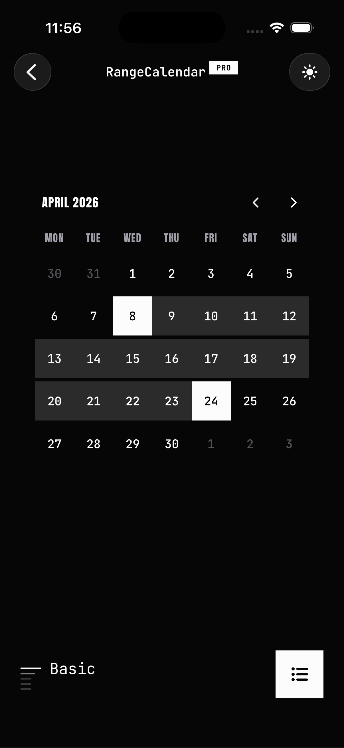
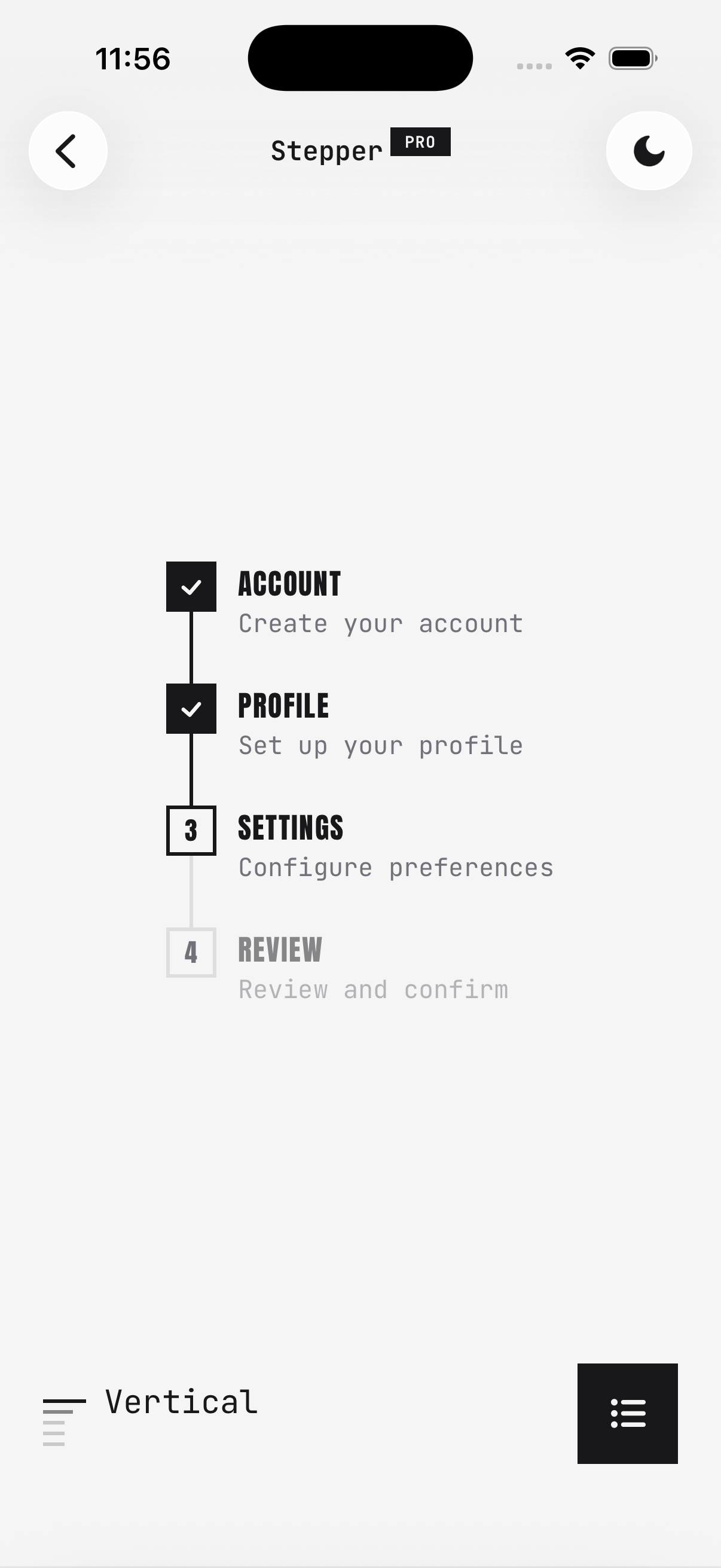
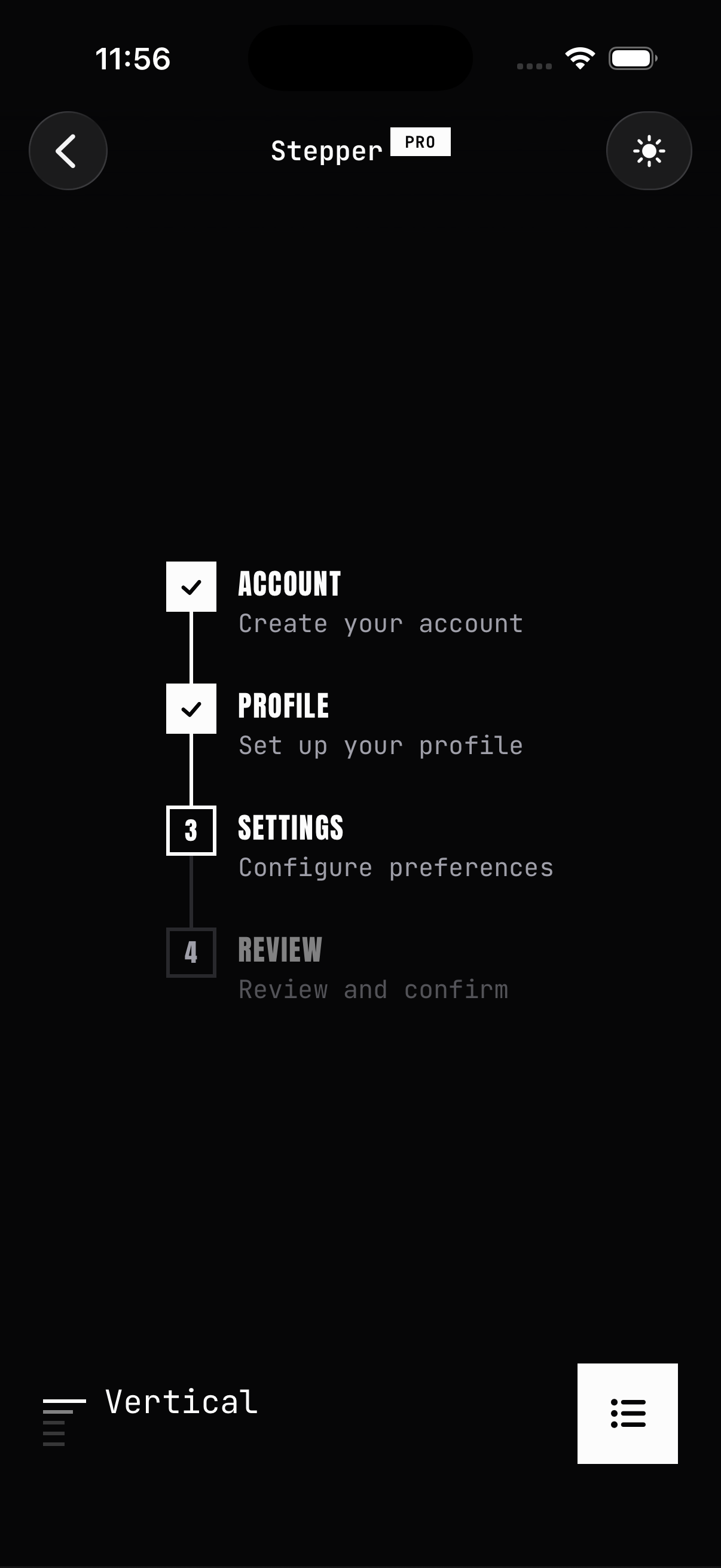
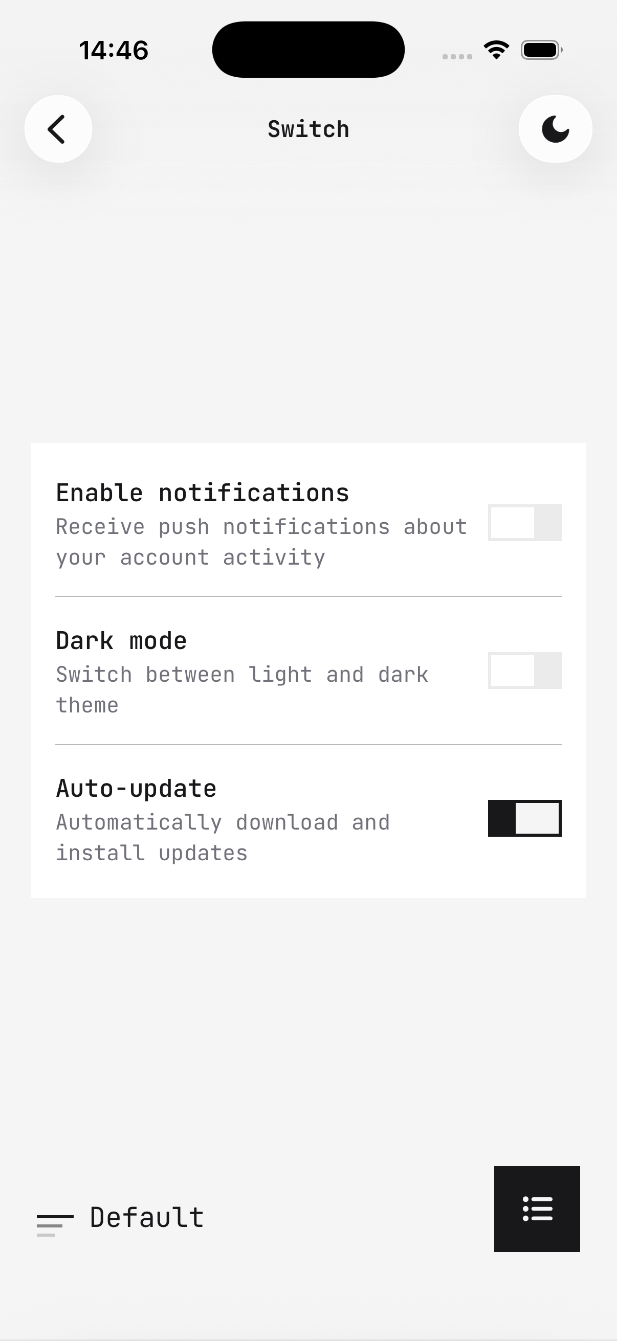
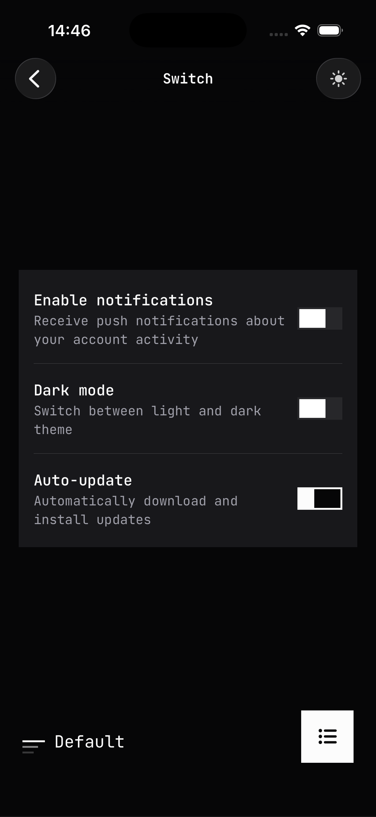
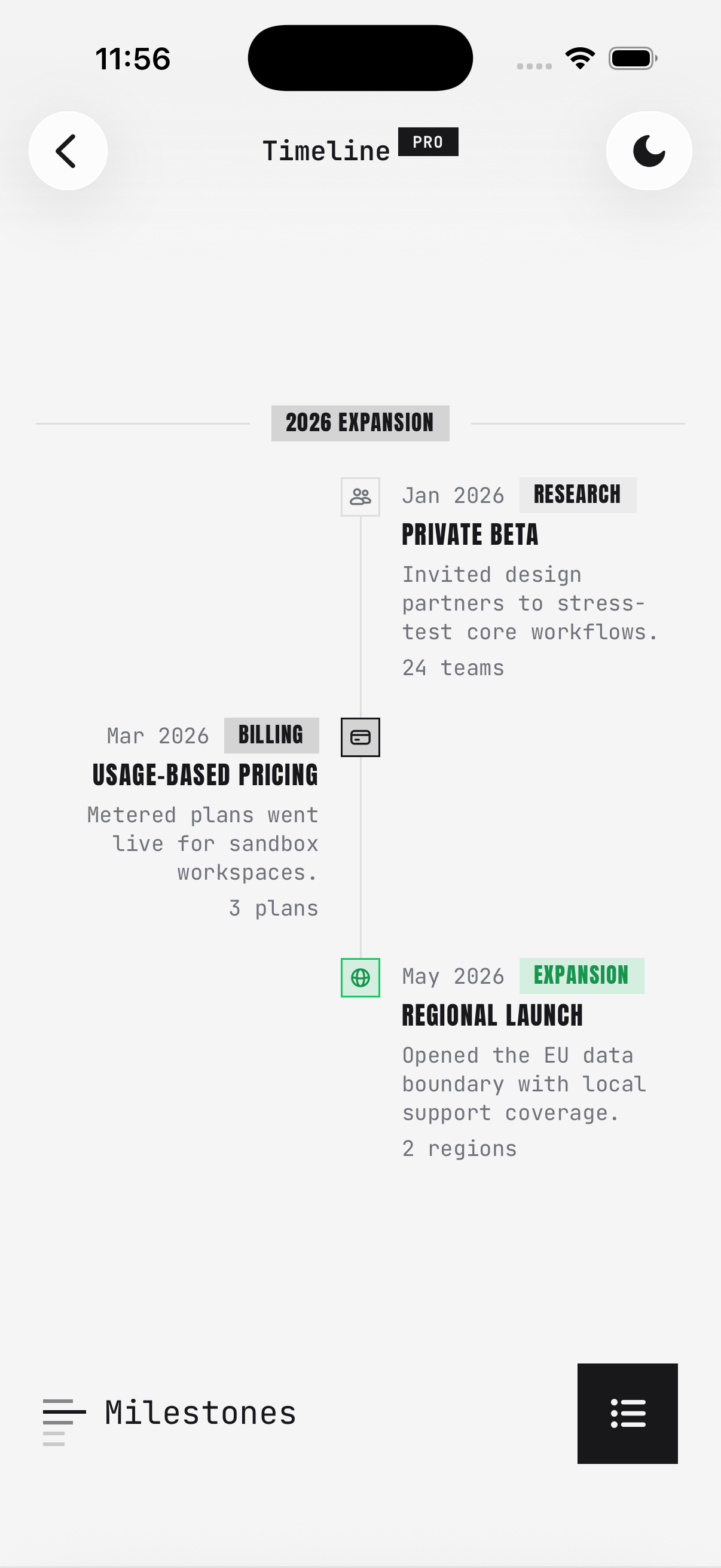
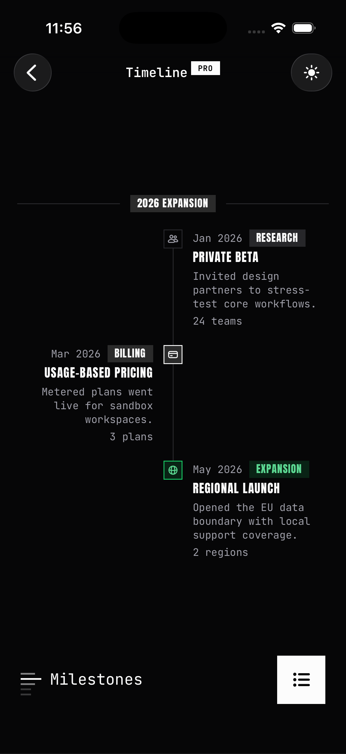
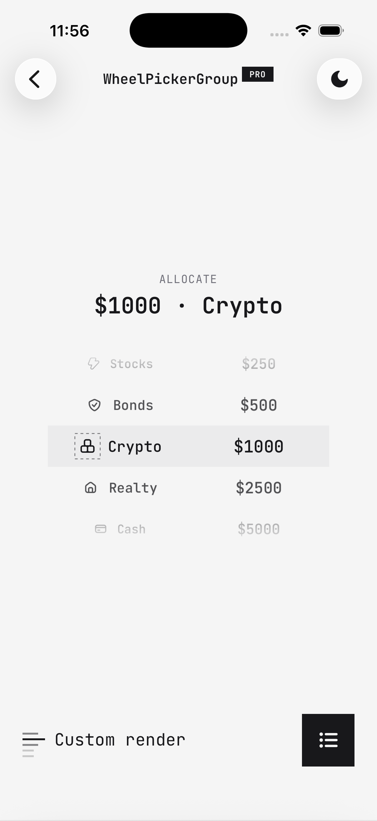
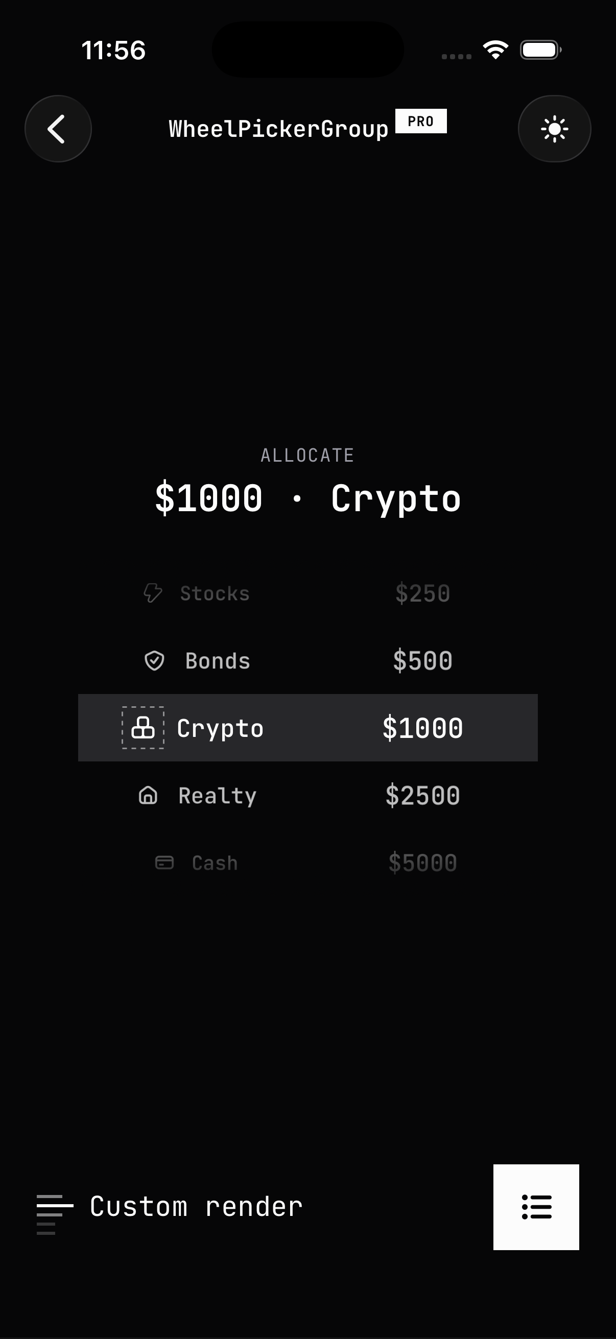
The new Brutalism theme restyles every component with bold borders, hard shadows, and display typography for a raw, high-contrast look. It ships with HeroUI Native Pro and is applied entirely through CSS — no per-component wiring.
Features:
- Restyles the full component library through the new BEM CSS layer
- High-contrast surfaces with bold borders and hard (non-blurred) shadows
- Monospace body typography plus a dedicated
--brutalism-font-displaydisplay font for labels - Full light and dark mode support
- Applied with a single
@import, layered on top of the default styles
Usage:
Import the theme in your global.css, right after the HeroUI Native Pro styles:
@import 'tailwindcss';
@import 'uniwind';

@import 'heroui-native/styles';
@import 'heroui-native-pro/styles';
@import 'heroui-native-pro/themes/brutalism';

@source './node_modules/heroui-native/lib';
@source './node_modules/heroui-native-pro/lib';
For complete setup instructions, font mapping, and a live preview, see the Brutalism theme page.
Updated Documentation
The following documentation has been added or updated to reflect the changes in this release:
- Themes — New overview page showcasing every HeroUI Native Pro theme
- Default — Documents the signature out-of-the-box look and its
@sourcesetup - Brutalism — New theme page covering installation, the
heroui-native-pro/themes/brutalismimport, and font mapping for the monospace body and display label fonts